Our goal when introducing a new app is to extend its accessibility, attract a broad spectrum of prospective customers, and persuade them to install our app.
Our goal when introducing a new app is to extend its accessibility, attract a broad spectrum of prospective customers, and persuade them to install our app. Even though we firmly believe our app icon and screenshots are perfect and visually compelling, we must consider the chance that they may not be as effective as we think. It’s crucial to personally verify the allure of our app page to users. Fortunately, Google and Apple provide robust tools that can assist us in accomplishing this objective. These resources allow us to conduct tests on the app page to determine which configuration yields the highest conversion rates.
Unlock Success in App Store Optimization with Effective A/B Testing Strategies
A/B testing, otherwise referred to as split testing, is an effective strategy used for carrying out randomized trials to enhance an app page’s performance. This process involves the concurrent presentation of two or more versions of a specific element, such as the app icon, screenshots, or descriptions. Thankfully, both Google and Apple offer tools that allow developers to conduct these A/B tests on their app pages. They permit developers to simultaneously test up to four different versions while gathering analytical data.
Exploring A/B Testing in the Google Play Store: A Look at Store Listing Experiments
The Google Play Console offers a plethora of analytical tools to developers for testing and enhancing the performance of their apps. It allows developers to examine up to six distinct metrics, thereby significantly enhancing the potential for app page refinement. A pivotal metric to evaluate is the app’s icon, which acts as the initial interaction between the user and the app. As the first graphic element potential users see when exploring the Google Play Store, it holds a crucial position in garnering their interest and promoting app downloads.
All metrics that can be evaluated:
- Screenshots,
- App icon,
- Short Description,
- Feature graphic,
- Video,
- Full Description.
Navigating A/B Testing Opportunities within the Google Play Console

Strategies for Implementing Effective A/B Testing in the Google Play Console

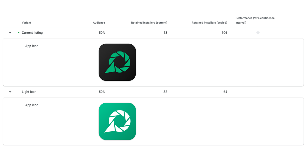
A key advantage of A/B testing is that results are usually refreshed on a daily basis, enabling developers to swiftly detect and adapt to shifts in user behavior. This implies that developers aren’t required to wait for the entire duration of the test to analyze the outcomes. In my situation, as evidenced by the screenshot, within two days, we can observe a significant superiority of the dark icon, which has approximately 60% more downloads than the light one! I terminated my test prematurely due to this considerable lead. However, under normal circumstances, when the difference isn’t as pronounced, it’s advisable to wait longer for the test results!
Enhancing Product Pages with A/B Testing on Apple’s App Store
Testing app page visuals on the Apple App Store comes with a narrower scope of measurable metrics compared to Google Play. However, Apple does provide developers the opportunity to test fundamental visual elements like screenshots and app icons. Even though app icons are testable, they typically hold less importance than screenshots, as the latter greatly influence our product page visits. It’s crucial for developers to initially test various screenshot styles to identify which versions resonate best with their intended audience.
After determining the most effective screenshot style, developers can then try different screen arrangements to further enhance performance. By fully utilizing these testable metrics, developers can attain the highest conversion rate. Through constant fine-tuning and iteration, we can yield astonishing results. At times, we might even witness a 100% surge in app downloads!
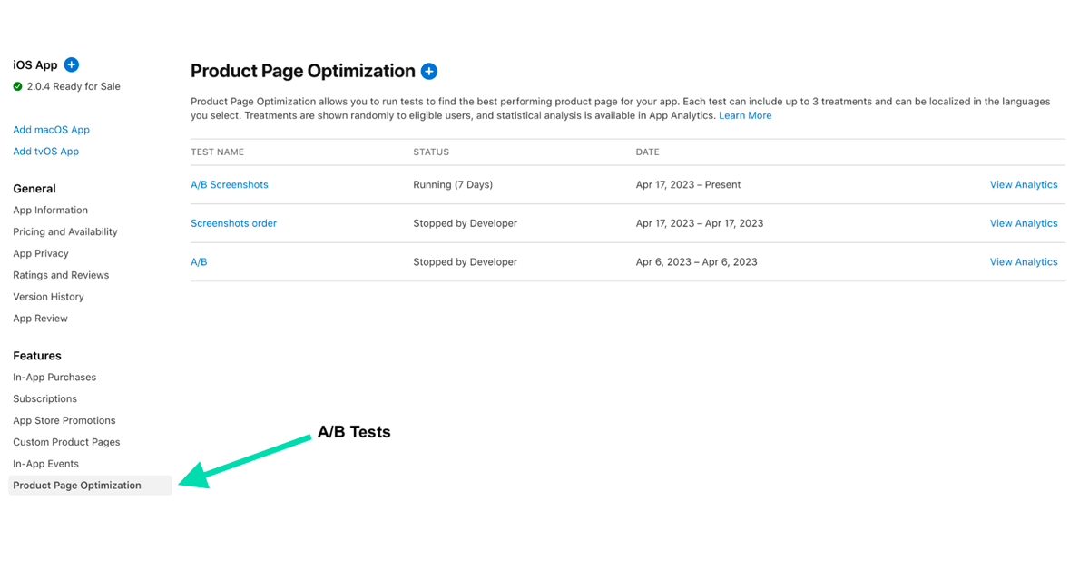
Identifying Opportunities for A/B Testing within App Store Connect

Strategies for Implementing Effective A/B Testing in the App Store Connect

In this specific instance, I’m undertaking a test to evaluate the effectiveness of diverse interventions by comparing the outcomes of Treatment A with my existing product page. After several days of monitoring, it seems that Treatment A has demonstrated a 13% enhancement over the status quo. However, given the brevity of the testing period so far, I acknowledge the need to wait a bit longer to acquire more precise and trustworthy results. This way, I can guarantee that any findings or determinations made from the data collected in this test are credible and significant.
Reach Your Target Audience: The Crucial Role of Consistent A/B Testing in User Engagement
It’s amazing how even the smallest changes in graphics can significantly affect the number of app downloads. That’s why it’s so important for developers to constantly experiment with different versions of an app’s page visuals and improve their performance through A/B testing. At Applover, we know that there is no one-size-fits-all solution for creating perfect screenshots or app icons; what works for one app may not produce the same results for another.
This underscores why A/B testing is an essential resource for developers. By evaluating multiple variations of an app’s page visualization, developers can identify the elements that connect most strongly with their target audiences and generate the highest conversion rates. By continually fine-tuning and improving the performance of an app page, developers can attract more users, increase engagement and ultimately drive business prosperity.
The app used as an example in this article was – Chatbot
Google Play: https://play.google.com/store/apps/details?id=com.intelli.app
App Store: https://apps.apple.com/us/app/id1668668188


