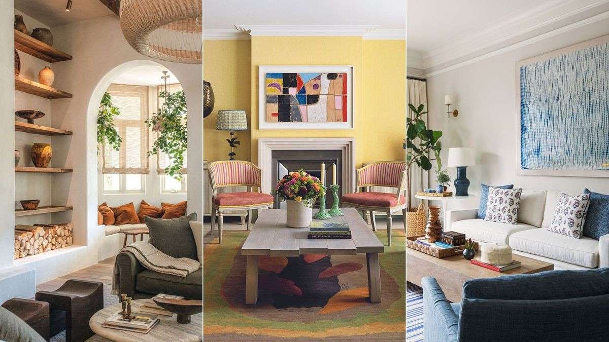
You are standing in the paint aisle with 50 shades of beige in your hand, and they all look the same under the fluorescent lights. You know the color you pick will define the entire room, but you have no idea which one will actually look good on your walls. Choosing paint colors for living room spaces is one of the most common decorating challenges because the same color looks different in every home depending on the light and the furnishings.
The right living room paint color creates a mood, makes the space feel larger or cozier, and ties your furniture and decor together. The wrong choice makes the room feel cold, dark, or chaotic. Here is how to choose wall shades that work with your specific space, lighting, and style preferences.
How Light and Room Size Affect Paint Color
The way a paint color looks in your living room depends more on the natural light and room size than on the color itself. The same shade of gray can look blue in a north-facing room, warm beige in a south-facing room, and flat and dull in a room with limited windows. Understanding these effects helps you pick a color that looks right at all times of day.
North-facing rooms receive cool, indirect light all day. Cool light makes warm colors look muted and cool colors look more intense. In a north-facing living room, warm neutrals like beige and greige perform best because they add warmth to the cool light. Cool grays and blues can feel cold and uninviting in these rooms.
South-facing rooms receive warm, direct light for most of the day. Warm light makes cool colors look softer and warm colors look more intense. In a south-facing living room, you can use a wider range of colors. Cool grays and blues look balanced rather than cold. Warm colors like yellow and orange may feel too intense in direct afternoon sunlight.
Small living rooms benefit from light, reflective colors that make the space feel larger. White, light gray, pale blue, and soft beige bounce light around the room and create an open feeling. Dark colors absorb light and make a small room feel smaller. If you want a dark color in a small living room, use it on one accent wall and keep the other walls light.
Large living rooms can handle darker colors and stronger hues. Dark navy, charcoal, forest green, and deep burgundy create a cozy, intimate feel in a large space. These colors make a cavernous room feel more inviting and grounded. A large room also handles two or three colors in a color scheme better than a small room does.
Neutral Paint Colors for Living Room
Neutral paint colors are the most popular choice for living rooms because they create a calm, timeless backdrop that works with any furniture style. The key to choosing a neutral is understanding the undertone. Every neutral has a warm or cool undertone, and the undertone determines how the color reads in your specific light.
Warm neutrals have yellow, red, or brown undertones. Beige, greige (gray-beige), warm gray, and cream are warm neutrals. These colors create a cozy, inviting atmosphere and pair well with wood furniture and warm-toned metals like brass and copper. Warm neutrals are the best choice for north-facing living rooms because they counteract the cool light.
Cool neutrals have blue, green, or violet undertones. Cool gray, gray-blue, and greige with a blue undertone are cool neutrals. These colors create a crisp, modern look and pair well with white trim and cool-toned metals like chrome and nickel. Cool neutrals work best in south-facing rooms where the warm light balances the cool undertone.
True neutrals have no strong undertone and appear balanced in any light. Pure white, true gray, and black are true neutrals. True neutrals are the safest choice for open-concept living rooms that connect to a kitchen or dining area with different lighting conditions. A true neutral in the living room ties the spaces together without creating a color clash.
Popular neutral paint colors for living rooms include Sherwin-Williams Agreeable Gray (a warm greige), Benjamin Moore Revere Pewter (a light warm gray), Behr Elephant Skin (a mid-tone warm gray), and Benjamin Moore Simply White (a clean warm white). These colors are bestsellers for a reason: they look good in almost every home.
Warm vs Cool Tones – What They Do to a Living Room
The temperature of a paint color affects the mood and perception of the living room. Warm colors advance visually, making a room feel cozier and more intimate. Cool colors recede visually, making a room feel larger and more open. The choice between warm and cool tones should match the function of your living room.
| Color temperature | Mood created | Best room direction | Popular examples |
| Warm (beige, cream, terracotta) | Cozy, inviting | North-facing | Kilim Beige, Accessible Beige |
| Cool (gray, blue, green) | Calm, spacious | South-facing | Gray Owl, Classic Gray |
| Neutral (greige, true gray) | Balanced, flexible | Any direction | Agreeable Gray, Revere Pewter |
Warm paint colors include beige, cream, yellow, peach, terracotta, and warm red. These colors work well in living rooms where you want a cozy, conversation-friendly atmosphere. A warm-toned living room feels inviting and comfortable, especially in the evening when the lights are low. Warm colors are ideal for formal living rooms and entertainment spaces.
Cool paint colors include gray, blue, green, and violet. These colors work well in living rooms where you want a calm, relaxed atmosphere. A cool-toned living room feels serene and spacious, making it ideal for reading nooks and media rooms. Cool colors are also a good choice for living rooms that get strong afternoon sun, as they balance the warmth of the direct light.
Many living rooms use a combination of warm and cool tones. A warm neutral on the walls with cool blue accent pillows, or a cool gray wall with warm wood furniture. The contrast between warm and cool creates visual interest and prevents the room from feeling one-dimensional. The key is to choose one dominant temperature and use the other as an accent.
Popular Paint Color Schemes by Living Room Style
Different living room styles call for different paint color schemes. Matching the color palette to the decor style creates a cohesive look that feels intentional and well-designed. Here are the best paint color schemes for common living room styles.
Modern farmhouse living rooms use warm whites, greiges, and soft beiges on the walls. The color palette is light and airy with warm undertones. Shiplap accent walls are often painted white or a lighter shade than the main walls. Popular colors include Benjamin Moore White Dove, Sherwin-Williams Creamy, and Behr Swiss Coffee.
Mid-century modern living rooms use warm wood tones paired with neutral walls and bold accent colors. The wall color is typically a warm white, light gray, or greige. Accent colors include mustard yellow, teal, burnt orange, and olive green. These accent colors appear on furniture, artwork, or a single accent wall.
Scandinavian living rooms use all-white or light gray walls with black and white accents. The palette is minimal and cool. The walls are typically painted in a bright white or light gray with a cool undertone. Pops of color come from plants, textiles, and artwork. Popular colors include Benjamin Moore Chantilly Lace and Sherwin-Williams Pure White.
Traditional living rooms use warm, rich colors like beige, taupe, gold, and burgundy. The wall color is typically a warm neutral with deeper trim colors. Traditional rooms feel layered and luxurious. Colors like Benjamin Moore Monroe Bisque and Sherwin-Williams Kilim Beige are popular choices for traditional living rooms.
Bohemian living rooms use earthy, saturated colors like terracotta, rust, mustard, deep teal, and plum. The wall color can be a bold saturated hue or a warm neutral with colorful accents. Boho rooms embrace color mixing and pattern layering. A terracotta accent wall with warm white on the other walls creates a grounded, earthy feel.
Accent Walls and Color Placement
An accent wall is a single wall painted in a different color than the other walls in the room. Accent walls add visual interest, define a focal point, and allow you to use a bold color without overwhelming the space. The key to a successful accent wall is choosing the right wall and the right contrast level.
The best wall for an accent is the one your eyes naturally go to when you enter the room. This is typically the wall with the fireplace, the wall behind the sofa, or the wall with a large piece of artwork. Avoid using the wall with windows or doors as an accent wall, because the openings break up the color and reduce the impact.
The contrast between the accent wall and the main walls determines the drama level. A low-contrast accent wall uses a color two to three shades darker than the main wall. This creates subtle depth without drawing too much attention. A high-contrast accent wall uses a bold, saturated color that stands out against the neutral main walls. This creates a dramatic focal point.
Color placement also matters for the ceiling and trim. White trim is the standard choice for most living rooms because it creates a clean transition between the wall color and the ceiling. The ceiling is typically painted white or a lighter version of the wall color. A ceiling painted a darker color than the walls makes the room feel more intimate but can also make the ceiling feel lower.
How to Test Paint Colors Before Committing
Testing paint colors before buying a full gallon is the most important step in choosing the right color. A paint color looks different on the wall than it does on a small swatch, and it looks different at different times of day. Testing prevents peeling, cracking, and the expensive mistake of painting the entire room in a color you hate.
Buy sample pots of your top three to five colors. Paint a two-foot by two-foot square on the wall in the room where the color will be used. Paint the sample on at least two different walls – one that gets direct light and one that is in shadow. This shows you how the color reads in different lighting conditions in the same room.
Follow these testing steps for best results:
- Buy sample pots of your top 3 to 5 colors.
- Paint a 2-foot by 2-foot square on two different walls.
- Observe the samples in morning, afternoon, and evening light.
- Check the colors under your artificial lighting at night.
- Hold paint chips next to furniture and flooring.
Live with the samples for at least three days. Look at them in the morning light, afternoon light, evening light, and under artificial light at night. Note how the color changes throughout the day. A color that looks warm and inviting in the morning may look cold and flat under the living room lamps at night.
Hold paint chips next to your furniture, flooring, and curtains. The wall color should complement the existing elements in the room. A beautiful paint color that clashes with your sofa or carpet is the wrong color for your space. The paint color does not exist in isolation – it lives in a room full of other colors.
An interior designer with 18 years of experience explained: “The most common mistake homeowners make is choosing a paint color from a tiny swatch and committing to a full gallon. The color always looks different on the wall. I recommend buying a sample pot and painting a large square on at least two different walls in the room. Live with it for three days before you decide. That simple step prevents expensive repainting and the frustration of living with a color you do not love.”
Frequently Asked Questions
What is the best color for a living room?
Warm neutrals like greige and warm gray are ideal. They work with any furniture and create a cozy atmosphere.
What are the most popular living room paint colors?
Agreeable Gray and Revere Pewter are popular. These neutrals work in most homes.
What paint color makes a small living room look bigger?
White, pale gray, and soft beige make rooms feel larger. Dark colors absorb light and shrink the space.
Should I use warm or cool colors in my living room?
Warm colors create a cozy feel. Cool colors create a calm feel. North-facing rooms benefit from warm tones.
What color should I use in an open-concept living room?
Use one neutral throughout for a cohesive look. A true neutral works best for connecting different zones.
Should I paint the living room ceiling the same color as the walls?
White on the ceiling is standard. Color drenching with the same color on walls and ceiling is trending for drama.
What is the best white for living room walls?
Swiss Coffee and Simply White are top living room whites. They have warm undertones for a cozy feel.
Can I use dark paint colors in a living room?
Yes, navy and charcoal work in large rooms or accent walls. Use dark on one wall and lighter shades on the rest.